plot_transition_map
- EfficientFrontier.plot_transition_map(x_axe='risk', figsize=None)
Plot Transition Map for optimized portfolios on the Efficient Frontier.
Transition Map shows the relation between asset weights and optimized portfolio properties:
CAGR (Compound annual growth rate)
Risk (annualized standard deviation of return)
- Parameters:
- x_axe{‘risk’, ‘cagr’}, default ‘risk’
Show the relation between weights and CAGR (if ‘cagr’) or between weights and Risk (if ‘risk’). CAGR or Risk are displayed on the x-axis.
- figsizetuple[float, float], default None
Figure size (width, height) in inches. If None, matplotlib default is used.
- Returns:
- Axes
Matplotlib axes with the plot.
Examples
>>> import matplotlib.pyplot as plt
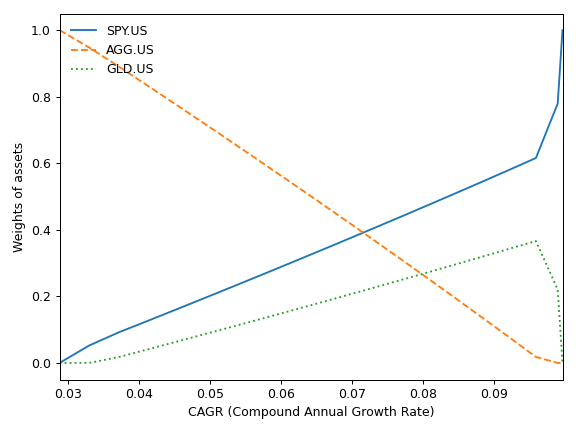
>>> x = ok.EfficientFrontier(["SPY.US", "AGG.US", "GLD.US"], ccy="USD", inflation=False)
>>> x.plot_transition_map()
>>> plt.show()
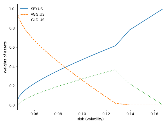
Transition Map with default settings shows the relation between risk (standard deviation) and asset weights for optimized portfolios. The same relation for CAGR can be shown by setting x_axe=’cagr’.
>>> x.plot_transition_map(x_axe="cagr")
>>> plt.show()