get_monte_carlo
- EfficientFrontier.get_monte_carlo(n=100)
Generate random rebalanced portfolios with Monte Carlo simulation.
Risk (annualized standard deviation) and return (CAGR) are calculated for random weights within bounds.
- Parameters:
- nint, default 100
Number of random portfolios to generate with Monte Carlo simulation.
- Returns:
- DataFrame
Table with Return (CAGR) and Risk values for random portfolios (portfolios with random asset weights).
Examples
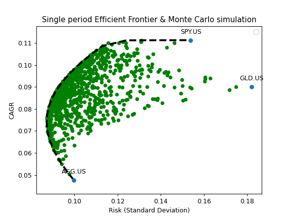
>>> ls_m = ["SPY.US", "GLD.US", "PGJ.US", "RGBITR.INDX", "MCFTR.INDX"]
>>> curr_rub = "RUB"
>>> x = ok.EfficientFrontier(
...     assets=ls_m,
...     first_date="2005-01",
...     last_date="2020-11",
...     ccy=curr_rub,
...     rebalancing_strategy=ok.Rebalance(period="year"),  # set rebalancing period to one year
...     n_points=20,
...     verbose=False,
... )
>>> monte_carlo = x.get_monte_carlo(n=1000)  # it can take some time ...
>>> monte_carlo.head(5)
       CAGR      Risk
0  0.182937  0.178518
1  0.184915  0.172965
2  0.154892  0.141681
3  0.185500  0.168739
4  0.176748  0.192657
Monte Carlo simulation results can be plotted together with the optimized portfolios on the Efficient Frontier.
>>> import matplotlib.pyplot as plt
>>> df_reb_year = x.ef_points  # optimize portfolios for EF. Calculations will take some time ...
>>> fig = plt.figure()
>>> # Plot the assets points (optional).
>>> x.plot_assets(kind="cagr")
>>> ax = plt.gca()
>>> # Plot random portfolios (Monte Carlo simulation)
>>> ax.scatter(monte_carlo.Risk, monte_carlo.CAGR)
>>> # Plot the Efficient Frontier
>>> ax.plot(df_reb_year.Risk, df_reb_year.CAGR, label="Annually rebalanced")
>>> # Set the axis labels and Title
>>> ax.set_title("Multi-period Efficient Frontier & Monte Carlo simulation")
>>> ax.set_xlabel("Risk (Standard Deviation)")
>>> ax.set_ylabel("CAGR")
>>> ax.legend()
>>> plt.show()