mdp_points
- property EfficientFrontier.mdp_points
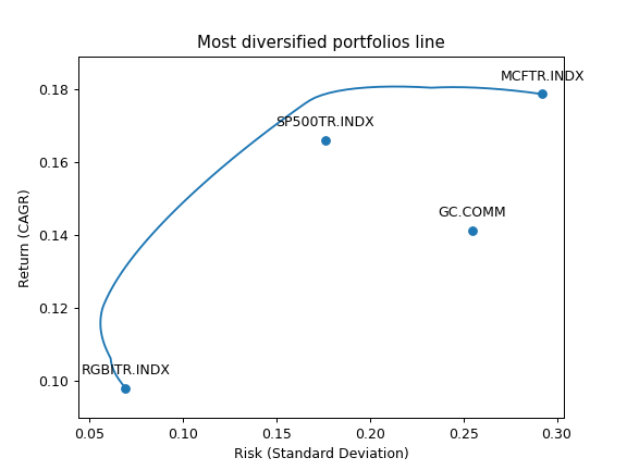
Generate Most diversified portfolios frontier for rebalanced portfolios.
Each point on the Most diversified portfolios frontier is a rebalanced portfolio with optimized Diversification ratio for a given CAGR.
The points are obtained through the constrained optimization process (optimization with bounds). Bounds are defined with ‘bounds’ property.
- Returns:
- DataFrame
Table of weights and risk/return values for the Most Diversified Portfolios Frontier. The columns:
assets weights
CAGR (geometric mean)
Risk (standard deviation)
Diversification ratio
All the values are annualized.
Examples
>>> ls4 = ["SP500TR.INDX", "MCFTR.INDX", "RGBITR.INDX", "GC.COMM"]
>>> y = ok.EfficientFrontier(assets=ls4, ccy="RUB", last_date="2021-12", n_points=20)
>>> y.mdp_points  # print mdp weights, risk, CAGR and Diversification ratio
        Risk      CAGR  Diversification ratio  ...    MCFTR.INDX   RGBITR.INDX  SP500TR.INDX
0   0.066040  0.092220               1.234567  ...  2.081668e-16  1.000000e+00  0.000000e+00
1   0.064299  0.093451               1.245678  ...  0.000000e+00  9.844942e-01  5.828671e-16
...
To plot the Most diversification portfolios line use the DataFrame with the points data. Additionally ‘Plot.plot_assets()’ can be used to show the assets in the chart.
>>> import matplotlib.pyplot as plt
>>> fig = plt.figure()
>>> # Plot the assets points
>>> y.plot_assets(kind="cagr")  # kind should be set to "cagr" as we take "CAGR" column from the mdp_points.
>>> ax = plt.gca()
>>> # Plot the Most diversified portfolios line
>>> df = y.mdp_points
>>> ax.plot(df["Risk"], df["CAGR"])  # we chose to plot CAGR which is geometric mean of return series
>>> # Set the axis labels and the title
>>> ax.set_title("Most diversified portfolios line")
>>> ax.set_xlabel("Risk (Standard Deviation)")
>>> ax.set_ylabel("Return (CAGR)")
>>> plt.show()