plot_assets
- AssetList.plot_assets(kind='mean', tickers='tickers', pct_values=False, xy_text=(0, 10), **kwargs)
Plot asset points on the risk-return chart with annotations.
Annualized values for risk and return are used. Risk is the standard deviation of monthly rate of return time series. Return can be an annualized mean return (expected return) or CAGR (compound annual growth rate).
- Parameters:
- kind{‘mean’, ‘cagr’}, default ‘mean’
Type of return: annualized mean return (expected return) or CAGR (compound annual growth rate).
- tickers{‘tickers’, ‘names’} or list of str, default ‘tickers’
Annotation type for assets.
‘tickers’: asset symbols are shown in the form ‘SPY.US’.
‘names’: asset names are shown (for example, ‘SPDR S&P 500 ETF Trust’).
list of str: custom annotations for each asset.
- pct_valuesbool, default False
If True, show risk and return values in percent. If False, show values as decimals.
- xy_texttuple, default (0, 10)
The shift of the annotation text (x, y) from the point.
- **kwargs
Arbitrary keyword arguments passed to matplotlib.pyplot.scatter.
- Returns:
- Axes
Matplotlib axes object.
Examples
>>> import matplotlib.pyplot as plt
>>> al = ok.AssetList(["SPY.US", "AGG.US"], ccy="USD", inflation=False)
>>> al.plot_assets()
>>> plt.show()
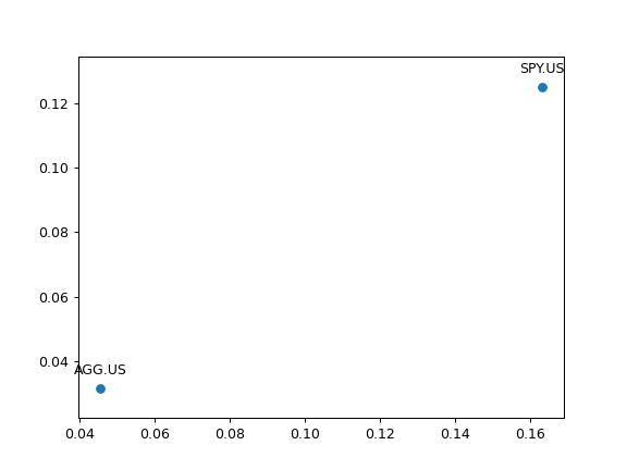
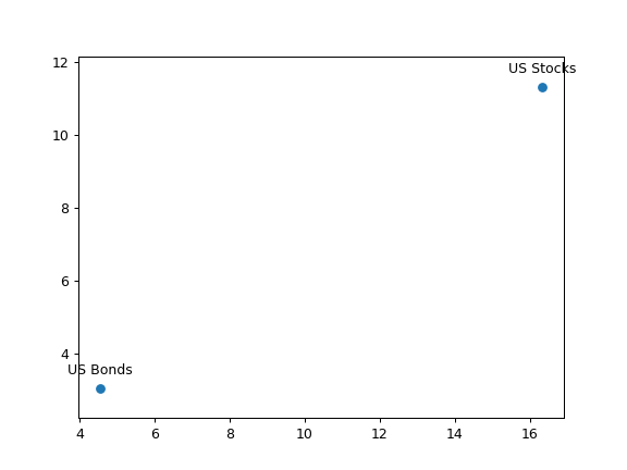
Plotting with default parameters values shows expected return, ticker annotations and algebraic values for risk and return. To use CAGR instead of expected return use kind=’cagr’.
>>> al.plot_assets(
...     kind="cagr",
...     tickers=["US Stocks", "US Bonds"],  # use custom annotations for the assets
...     pct_values=True,  # risk and return values are in percents
... )
>>> plt.show()